Smart Money Concepts (SMC)Introductions:
Before explaining the functions of this indicator to you, we need to talk about what theoretical knowledge we need to have. Many different price approaches have been developed over the decades with different analysis methods and are still evolving. Some theories used in classical trend analysis methods are interpreted or blended with different perspectives over time and we try to make more successful analyses by having a consistent market reading strategy. While analyzing the classical market structure with the price action method, some issues that are missing and do not fit into place are brought to light with a higher level analysis method known as the smart money concept.
As a result of the research and developments we have done on this subject from many different sources for a long time, I personally think that the most efficient and logical concept is the smart money concept. Of course, no matter which method we use, acting within a risk management and remaining strictly loyal to our conditions should be our first priority so that we can talk about sustainable success in the market. In light of all this, we decided to make an indicator of this concept, which we believe is consistent.
In order to analyze the market structure correctly, we must first draw fractal structures and interpret them correctly. Because the market consists of fractal structures. Regardless of the technique, if we cannot draw fractals correctly or if we make an incorrect interpretation while determining them, our market structure analysis may also be incorrect.
Instead of manually identifying fractal structures, script writers often choose the following method for ease of use; They leave the number of candles to the user's choice, detect the highest and lowest points among x number of candles, and draw fractal structures accordingly, but in fact this is not an accurate detection method. In the visual I have prepared below, you can see how the correct fractal structures should be drawn. Fractal structures should be made based on the previous and next candle levels, not from a certain group of candles.
To identify market structures, we make an interpretation based on these fractal movements.
While classic market structure analysis with traditional price action follows a relatively simpler path as shown in the example below, this situation is a bit more detailed in the smart money concepts.
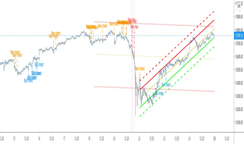
To explain the situation in the smart money concept in an easily understandable way, it is as follows; imagine an uptrend that progresses by creating levels HH and HL, when the price creates a new HL, we call this point as inducement and we move this level up as each new HL is formed. When drawing structures in this way, when the price falls below the inducement level, the peak is confirmed. To explain it with a different approach, the price must first get liquidity from these last rising bottoms in order to make a break of structure (BOS). The break of structure occurs when the price passes the approved peak. When BOS occurs, the lowest point between this point and the previous peak is defined as the Swing Low and this is the level that needs to be protected in uptrend. When BOS occurs, the last HL point that made this BOS is also defined as inducement and it continues to move as new HL is formed until the new peak is confirmed. If the price somehow "closes" below the Swing Low point that needs to be protected, CHOCH (change of character) has occurred and the trend direction has changed. After CHOCH, we start applying the same logic for the downtrend, the last LH peak formed after is defined as inducement and as the fractal structure continues downward, this level is also carried as the inducement level until the Swing Low level is determined. An important note is; In order for BOS and CHOCH to be valid, "a closing must definitely occur". If it remains in the form of a wick, we call it a liquidity sweep and the end point of this wick is updated as the point where we need to look for a closing in order to be able to say that the BOS or CHOCH level is determined. By the way, We call these liquidity sweep points as "x" in the indicator.
It may be easier to explain this topic with a few sample images that I have shared below.
The thing to consider in the smart money concept is that if you are going to take a long trade in an uptrend, you should wait for the price to fall below the inducement level or if you are going to take a short trade in a downtrend, you should wait for the price to rise above the inducement level and only then look for suitable structures, order flows, order blocks, price gaps and other structures before this are considered traps in this concept. I have some strategies that I personally apply, but since these are my personal preferences, I do not find it right to share them here in order not to affect your opinions, but I am basically careful to act as I stated above.
While preparing this script, we paid attention to the fact that it can be interpreted with a real human eye, provides ease at the speed of machine language and can work extremely flawlessly.
From the first moment we started preparing the script, we went through a long and seriously laborious preparation process that lasted months until now, which we happily share.
We brought this code to life by putting on the table almost everything the user may want in terms of both flawlessly fulfilling the conditions specified by the concept and convenience.
If we touch on the function of the code in order, our code finds the following;
It perfectly identifies the fractals that form the basis of the market structure, within the framework of the rules that I mentioned above, we taught to the script.
According to smart money concepts, as I explained in detail above, it provides great convenience in this regard by skillfully identifying the direction of the market in the time period you are in, rather than traditional methods.
In addition to identifying the direction of the market, it also detects the direction changes taking place in the internal structure. Indicator tries to detect even the slightest direction changes by making a stricter interpretation while determining the trend and bottom-top points in the internal structure. Theoretically, it determines the top point in a downward fractal breakout, and marks the bottom point in an upward fractal breakout.
In this context, it also uniquely identifies the candle flow direction and we can observe it on the table. I explained this issue in the first image about fractal determination, you can read that part again.
When you identify swing structures correctly, you will also determine the area you need to focus on, and we have also included this in the script.
Another one of our favorite features on the chart is that it can show active swing areas live by following the BOS, CHOCH and Inducement lines. So, I believe that this gives it a more professional appearance.
In the light of all these functions, it provides great ease of use while presenting data on the direction of the market in a table not only in the current time frame but also in 6 different time frames that the user can choose according to his/her preference, including seconds timeframes (1 sec., 5 sec., 15 sec., 30 sec. etc.)
In order to speed up the user, it instantly informs the selected parity and all structural changes (Bos, Choch, Inducement, Liquidity Sweeps etc.) that occur on the market structure of this timeframe by setting a single alarm.
In the settings window, you will find the following settings that we have personalized for you:
Main Options;
Fractal Lines box: You can check this box to see whether the fractals that form the basic interpretation structure of the indicator are visible or not.
Swing Lines box: You can use this box to turn on or off the Bos, Choch, Inducement and Liquidity Sweeps lines, which are the main elements of the market structure.
Internal Structures box: You can check this box to observe the H and L points in the internal structure of the graph and therefore the direction in the internal structure.
Live Bos / Choch / Inducement Lines box: You can turn on / off the visibility of the lines belonging to the current and active Bos, Choch and Inducement levels on the chart.
Range Lines box: You can use it to turn on / off the visibility of range lines drawn between the active Swing high and Swing low points on the chart.
Multitimeframe Tables box: It allows you to open and close the table where you can observe the main trend direction of the current parity on the screen, its internal structure and the candle flow direction in 6 different time frames.
Fractal Settings;
In this section, you can choose the colors, style and thickness of the fractal lines as you wish.
Swing Settings;
In this section you can choose the colors of the Swing High and Swing Low points, their shape and size.
Likewise, you can choose the colors, line style, thickness and text size of Bos and Choch lines for bullish and bearish situations.
There are also settings where you can choose the colors, style, line thickness and text size of the Liquidity Sweep and Inducement lines.
Internal Swing Settings;
In this section, you can determine the colors of the High and Low points detected in the internal structure and select the label size, style and thickness of the direction change lines.
Live BOS / CHOCH / IDM Lines;
In this section, you can select the colors, label sizes, line style and thickness of the bos, choch and inducement lines that show the important levels followed in the current status of the chart.
Range Settings;
As mentioned above, you can choose the color, style, thickness of the range lines drawn between the active swing high and swing low points and the size of the price tags of these levels.
Multitimeframe Table Settings;
In this section, there are settings boxes for 6 selectable timeframes, 9 different position alternatives where you can change the position of the table, and a section where you can find 2 different options to express the directions in the table. In addition to these, you will also be able to choose the background color of the table and the color of the text used to express the directions in the table.
We hope that this script will reach a wide audience by becoming a tool that will be used with pleasure and indispensable, while providing convenience to all users, as we have dreamed of and expected from the first moment we started writing it.
DISCLAIMER: No sharing, copying, reselling, modifying, or any other forms of use are authorized for the documents, script / strategy, and the information published with them. This informational planning script / strategy is strictly for individual use and educational purposes only. This is not financial or investment advice. Investments are always made at your own risk and are based on your personal judgement. We are not responsible for any losses you may incur. Please invest wisely.
Best regards and enjoy it.
"the script"に関するスクリプトを検索

Optimal Buy Day (Zeiierman)█ Overview
The Optimal Buy Day (Zeiierman) indicator identifies optimal buying days based on historical price data, starting from a user-defined year. It simulates investing a fixed initial capital and making regular monthly contributions. The unique aspect of this indicator involves comparing systematic investment on specific days of the month against a randomized buying day each month, aiming to analyze which method might yield more shares or a better average price over time. By visualizing the potential outcomes of systematic versus randomized buying, traders can better understand the impact of market timing and how regular investments might accumulate over time.
These statistics are pivotal for traders and investors using the script to analyze historical performance and strategize future investments. By understanding which days offered more shares for their money or lower average prices, investors can tailor their buying strategies to potentially enhance returns.
█ Key Statistics
⚪ Shares
Definition: Represents the total number of shares acquired on a particular day of the month across the entire simulation period.
How It Works: The script calculates how many shares can be bought each day, given the available capital or monthly contribution. This calculation takes into account the day's opening price and accumulates the total shares bought on that day over the simulation period.
Interpretation: A higher number of shares indicates that the day consistently offered better buying opportunities, allowing the investor to acquire more shares for the same amount of money. This metric is crucial for understanding which days historically provided more value.
⚪ AVG Price
Definition: The average price paid per share on a particular day of the month, averaged over the simulation period.
How It Works: Each time shares are bought, the script calculates the average price per share, factoring in the new shares purchased at the current price. This average evolves over time as more shares are bought at varying prices.
Interpretation: The average price gives insight into the cost efficiency of buying shares on specific days. A lower average price suggests that buying on that day has historically led to better pricing, making it a potentially more attractive investment strategy.
⚪ Buys
Definition: The total number of transactions or buys executed on a particular day of the month throughout the simulation.
How It Works: This metric increments each time shares are bought on a specific day, providing a count of all buying actions taken.
Interpretation: The number of buys indicates the frequency of investment opportunities. A higher count could mean more consistent opportunities for investment, but it's important to consider this in conjunction with the average price and the total shares acquired to assess overall strategy effectiveness.
⚪ Most Shares
Definition: Identifies the day of the month on which the highest number of shares were bought, highlighting the specific day and the total shares acquired.
How It Works: After simulating purchases across all days of the month, the script identifies which day resulted in the highest total number of shares bought.
Interpretation: This metric points out the most opportune day for volume buying. It suggests that historically, this day provided conditions that allowed for maximizing the quantity of shares purchased, potentially due to lower prices or other factors.
⚪ Best Price
Definition: Highlights the day of the month that offered the lowest average price per share, indicating both the day and the price.
How It Works: The script calculates the average price per share for each day and identifies the day with the lowest average.
Interpretation: This metric is key for investors looking to minimize costs. The best price day suggests that historically, buying on this day led to acquiring shares at a more favorable average price, potentially maximizing long-term investment returns.
⚪ Randomized Shares
Definition: This metric represents the total number of shares acquired on a randomly selected day of the month, simulated across the entire period.
How It Works: At the beginning of each month within the simulation, the script selects a random day when the market is open and calculates how many shares can be purchased with the available capital or monthly contribution at that day's opening price. This process is repeated each month, and the total number of shares acquired through these random purchases is tallied.
Interpretation: Randomized shares offer a comparison point to systematic buying strategies. By comparing the total shares acquired through random selection against those bought on the best or worst days, investors can gauge the impact of timing and market fluctuations on their investment strategy. A higher total in randomized shares might indicate that over the long term, the specific days chosen for investment might matter less than consistent market participation. Conversely, if systematic strategies yield significantly more shares, it suggests that timing could indeed play a crucial role in maximizing investment returns.
⚪ Randomized Price
Definition: The average price paid per share for the shares acquired on the randomly selected days throughout the simulation period.
How It Works: Each time shares are bought on a randomly chosen day, the script calculates the average price paid for all shares bought through this randomized strategy. This average price is updated as the simulation progresses, reflecting the cost efficiency of random buying decisions.
Interpretation: The randomized price metric helps investors understand the cost implications of a non-systematic, random investment approach. Comparing this average price to those achieved through more deliberate, systematic strategies can reveal whether consistent investment timing strategies outperform random investment actions in terms of cost efficiency. A lower randomized price suggests that random buying might not necessarily result in higher costs, while a higher average price indicates that systematic strategies might provide better control over investment costs.
█ How to Use
Traders can use this tool to analyze historical data and simulate different investment strategies. By inputting their initial capital, regular contribution amount, and start year, they can visually assess which days might have been more advantageous for buying, based on historical price actions. This can inform future investment decisions, especially for those employing dollar-cost averaging strategies or looking to optimize entry points.
█ Settings
StartYear: This setting allows the user to specify the starting year for the investment simulation. Changing this value will either extend or shorten the period over which the simulation is run. If a user increases the value, the simulation begins later and covers a shorter historical period; decreasing the value starts the simulation earlier, encompassing a longer time frame.
Capital: Determines the initial amount of capital with which the simulation begins. Increasing this value simulates starting with more capital, which can affect the number of shares that can be initially bought. Decreasing this value simulates starting with less capital.
Contribution: Sets the monthly financial contribution added to the investment within the simulation. A higher contribution increases the investment each month and could lead to more shares being purchased over time. Lowering the contribution decreases the monthly investment amount.
-----------------
Disclaimer
The information contained in my Scripts/Indicators/Ideas/Algos/Systems does not constitute financial advice or a solicitation to buy or sell any securities of any type. I will not accept liability for any loss or damage, including without limitation any loss of profit, which may arise directly or indirectly from the use of or reliance on such information.
All investments involve risk, and the past performance of a security, industry, sector, market, financial product, trading strategy, backtest, or individual's trading does not guarantee future results or returns. Investors are fully responsible for any investment decisions they make. Such decisions should be based solely on an evaluation of their financial circumstances, investment objectives, risk tolerance, and liquidity needs.
My Scripts/Indicators/Ideas/Algos/Systems are only for educational purposes!

No Wick Bull/Bear Candlesticks with Arrow premiumNo Wick Bull/Bear Candlesticks with Arrow premium
This script is for a custom trading indicator called "No Wick Bull/Bear Candlesticks with Arrow premium" developed by ClearTradingMind. It is designed for use with trading platforms that support scripting, such as TradingView. This indicator combines several technical analysis tools to help traders identify potential buy and sell signals in a financial market.
Key Components of the Indicator:
Moving Average (MA): The script allows users to select from various types of moving averages (SMA, EMA, HMA, etc.), which smooth out price data to identify trends. Users can set the length and type of the moving average.
Upper and Lower Bands: These bands are set at a specified deviation percentage above and below the chosen moving average. They help in identifying overbought and oversold conditions.
No Wick Bull/Bear Candlestick Identification:
Bullish Condition: A bullish candlestick is identified when the closing price is higher than the opening price, the low equals the open, and the close is above the moving average.
Bearish Condition: A bearish candlestick is identified when the closing price is lower than the opening price, the high equals the open, and the close is below the moving average.
No Wick: These conditions also imply that the candlesticks have no wicks, suggesting strong buying or selling pressure.
Arrows for Trading Signals:
No lower wick bull bar
No upper wick bear bar
When a bullish condition is met, a green upward-pointing triangle is plotted below the candlestick, indicating a potential buy signal.
When a bearish condition is met, a red downward-pointing triangle is plotted above the candlestick, indicating a potential sell signal.
EMA 20: An additional Exponential Moving Average with a length of 20 periods is plotted for further trend analysis.
Background Color Changes: The script changes the background color to blue if the EMA 20 is above the upper band, and to red if it is below the lower band, providing visual cues about the market trend.
How It Works:
Traders can input their preferences for the moving average type and length, source of the MA (like closing prices), and the deviation percentage for the bands.
The script then calculates the moving average, upper and lower bands, and checks for bullish or bearish candlestick conditions without wicks.
When such conditions are met, it plots arrows to suggest buy or sell signals.
The EMA 20 and background color changes offer additional trend information.
Usage:
This indicator is particularly useful in markets with clear trends. The no wick bull/bear candlesticks indicate strong buying or selling pressure, and the arrows provide clear visual signals for traders to consider entering or exiting positions. As with all trading indicators, it's recommended to use this tool in conjunction with other forms of analysis to confirm trading signals.

Thunderbird PoCWhat kind of traders/investors are we?
We are trend followers. Our scripts are designed to be used on the higher timeframes (daily/weekly/monthly) to catch significant moves/trends in the market. While many are aware of the power of trend following, not all have the tools to execute it effectively. Our scripts are tailored to pinpoint and capitalise on long-term market trends.
What does this script do?
The Thunderbird PoC is a tool for investors looking to capitalise on breakout opportunities. When a breakout of the Donchian occurs, the script produces a signal. This signal is then used to display the entry, stop, and compound levels in the data window. One of its standout features is its ability to show levels for the bar where the mouse is hovering. This allows investors to analyse entry levels from past signals retrospectively. All this information is also conveniently displayed in the data window.
How is the PoC produced?
The PoC is meticulously calculated using a formula the encapsulates ATR. Upon a breakout signal, an entry-level is determined. For a bullish breakout, the entry is set a fixed % leve above the high, and for a bearish breakout, at a fixed % level below. The stop loss level is then calculated by using the ATR formula below the entry for long positions and above for short positions. The compound level is also set using an ATR formula above the entry for long positions and below for short ones.
What is the best timeframe to use the script?
The Thunderbird PoC is optimised for the daily timeframe. This is where the breakout signals are most effective and reliable. By focusing on the daily timeframe, investors can capture significant market movements and avoid the noise of shorter timeframes.
What makes this script unique?
The Thunderbird PoC stands out in its ability to provide investors with a retrospective view of the market. By allowing users to see the levels for the bar where the mouse is, it offers a unique perspective on past signals, enabling investors to learn and adapt from historical data. This feature, combined with its detailed display in the data window, makes it an invaluable tool for those looking to use trend-following techniques.
This tool removes the need of manually having to calculate the entry, stop loss, compound and risk-free levels yourself.
This script has been coded specifically for the daily timeframe to:
Highlight the start of potential long-term trends.
Confirm entry points at the end of the trading day, absorbing intraday noise.
Reduce fake breakouts in a trend.
Continue to create entry points as the trend develops to allow for compounding.
Filter out breakouts in a sideways market.
This entry signal script helps investors focus on the quality of a potential position when investing in long-term market trends.

Sublime Trading | Trailing StoplossWhat kind of traders/investors are we?
We are trend followers. Our scripts are designed to be used on the higher timeframes (weekly/daily) to catch the large moves/trends in the market.
Most have heard of long-term trend following. Few know how to execute the strategy.
Our scripts are designed specifically to identify and invest in long-term market trends.
What does this script do?
The exit from a position is arguably more important than the entry.
Traders/Investors will regularly find themselves in an asset based on some logic, but the exit management is very much an afterthought.
Hence why traders often take profit too early and hold onto losing positions. It is emotionally driven.
The Trailing Stoploss script is designed to remove the guesswork and show you precise levels you will want to consider exiting a position when an asset reverses.
How is the trailing stoploss produced?
The script uses the formula ATR 15 x 4.
We use ATR as it produces a stoploss which is unique to the volatility of the asset. The more volatile the asset, the wider the stoploss.
We use ATR 15 as it brings an average reading across half a month, incorporating days of extreme volatility.
The multiplier 4 works well to avoid positions being stopped out prematurely on pullbacks.
When the trailing stoploss is hit, this is where you will want to consider taking profit.
What is the best timeframe to use the script?
We recommend the daily timeframe as this is where trend followers enter assets to maximise the potential of long-term trends.
The higher timeframes are where traders and investors take fewer positions and hold for longer time periods.
The trailing stoploss follows the price of the asset a distance away to give the trend structure enough space and time to develop.
A trend is ultimately a function of time. If you eliminate time, you eliminate the trend. If you eliminate the trend, you eliminate profit.
The Trailing Stoploss script is necessary for investors who appreciate that profit is accumulated by letting winning positions run and not taking profit too early.
What makes this script unique?
Exit management and knowing when to let go of an asset is one of the main struggles budding investors face. This script has been coded specifically for the daily timeframe to:
Create a trailing stoploss that is unique to the volatility of the asset.
Allow investors to stay in positions for the duration of the trend over many months.
To distinguish between a pullback and a market reversal, allowing for discretion.
This TSL script is designed to manage positions investors take in line with long-term market trends.
Sublime Trading | Donchian Breakout SignalsWhat kind of traders/investors are we?
We are trend followers. Our scripts are designed to be used on the higher timeframes (weekly/daily) to catch the large moves/trends in the market.
Most have heard of long-term trend following. Few know how to execute the strategy.
Our scripts are designed specifically to identify and invest in long-term market trends.
What does this script do?
It produces entry signals in a confirmed bull and bear trend.
The logic is based on Donchian 20, which serves the following two purposes:
1. Confirms end-of-day entry points in a long-term trend
2. Filters out entry points in a sideways market
The signal is produced on a break and close of the Donchian 20 high in a bull trend and a break and close of the Donchian 20 low in a bear trend.
How is the entry price produced?
The entry is based on a percentage value of the range of the breakout bar added to the high of the bar in a bull trend.
In a bear trend, the percentage is subtracted from the low of the bar.
This gives an objective entry when placing a position once the OHLC of a bar is confirmed at the end of the trading day.
How is the stoploss price produced?
The script uses the formula ATR 15 x 4.
We use ATR as it produces a stoploss which is unique to the volatility of the asset. The more volatile the asset, the wider the stoploss.
We use ATR 15 as it brings an average reading across half a month, incorporating days of extreme volatility.
The multiplier 4 works well to avoid positions being stopped out prematurely on pullbacks.
When the stoploss is hit, there is when traders and investors may consider exiting positions.
What is the best timeframe to use the script?
We recommend the daily timeframe as this is where trader and investors identify and enter long-term market trends.
The higher timeframes are where traders and investors take fewer positions but hold for longer time periods.
As a result, trend followers place priority on the quality of the entry rather than quantity.
What makes this script unique?
This script has been coded specifically for the daily timeframe to:
Highlight the start of a potential long-term trends.
Confirm entry points at the end of the trading day, absorbing intraday noise.
Reduce fake breakouts in a trend.
Continue to create entry points as the trend develops to allow for compounding.
Filter out breakouts in a sideways market.
This entry signal script helps traders and investors focus on the quality of a potential position when investing in long-term market trends.

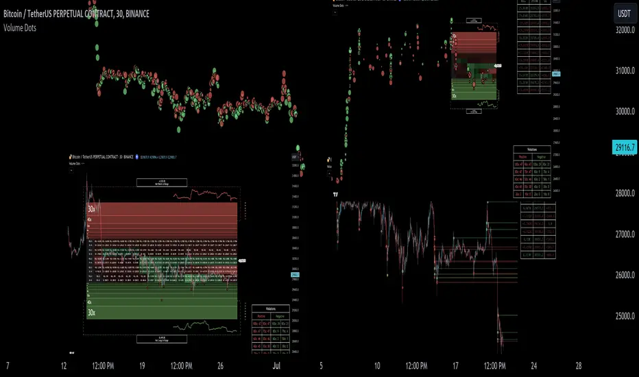
Liquidation Ranges + Volume/OI Dots [Kioseff Trading]Hello!
Introducing a multi-faceted indicator "Liquidation Ranges + Volume Dots" - this indicator replicates the volume dot tools found on various charting platforms and populates a liquidation range on crypto assets!
Features
Volume/OI dots populated according to user settings
Size of volume/OI dots corresponds to degree of abnormality
Naked level volume dots
Fixed range capabilities for volume/OI dots
Visible time range capabilities for volume/OI dots
Lower timeframe data used to discover iceberg orders (estimated using 1-minute data)
S/R lines drawn at high volume/OI areas
Liquidation ranges for crypto assets (10x - 100x)
Liquidation ranges are calculated using a popular crypto exchange's method
# of violations of liquidation ranges are recorded and presented in table
Pertinent high volume/OI price areas are recorded and presented in table
Personalized coloring for volume/OI dots
Net shorts / net long for the price range recorded
Lines shows reflecting net short & net long increases/decreases
Configurable volume/OI heatmap (displayed between liquidation ranges)
And some more (:
Liquidation Range
The liquidation range component of the indicator uses a popular crypto exchange's calculation (for liquidation ranges) to populate the chart for where 10x - 100x leverage orders are stopped out.
The image above depicts features corresponding to net shorts and net longs.
The image above shows features corresponding to liquidation zones for the underlying coin.
The image above shows the option to display volume/oi delta at the time the corresponding grid was traded at.
The image above shows an instance of using the "fixed range" feature for the script.
*The average price of the range is calculated to project liquidation zones.
*Heatmap is calculated using OI (or volume) delta.
Huge thank you to Pine Wizard @DonovanWall for his range filter code!
Price ranges are automatically detected using his calculation (:
Volume / OI Dots
Similar to other charting platforms, the volume/OI dots component of the indicator distinguishes "abnormal" changes in volume/OI; the detected price area is subsequently identified on the chart.
The detection method uses percent rank and calculates on the last bar of the chart. The "agelessness" of detection is contingent on user settings.
The image above shows volume dots in action; the size of each volume dot corresponds to the amount of volume at the price area.
Smaller dots = lower volume
Larger dots = higher volume
The image above exemplifies the highest aggression setting for volume/OI dot detection.
The table oriented top-right shows the highest volume areas (discovered on the 1-minute chart) for the calculated period.
The open interest change and corresponding price level are also shown. Results are listed in descending order but can also be listed in order of occurrence (most relevant).
Additionally, you can use the visible time range feature to detect volume dots.
The feature shows and explains how the visible range feature works. You select how many levels you want to detect and the script will detect the selected number of levels.
For instance, if I select to show 20 levels, the script will find the 20 highest volume/OI change price areas and distinguish them.
The image above shows a narrower price range.
The image above shows the same price range; however, the script is detecting the highest OI change price areas instead of volume.
* You can also set a fixed range with this feature
* Naked levels can be used
Additionally, you can select for the script to show only the highest volume/ OI change price area for each bar. When active, the script will successively identify the highest volume / OI change price area for the most recent bars.
Naked Levels
The image above shows and explains how naked levels can be detected when using the script.
And that's pretty much it!
Of course, there're a few more features you can check out when you use the script that haven't been explained here (:
Thank you again to @DonovanWall
Thank you to @Trendoscope for his binary insertion sort library (:
Thank you to @PineCoders for their time library
Thank you for checking this out!
Reversal Signals [LuxAlgo]The Reversal Signals indicator is a technical analysis tool that aims to identify when a trend is fading and potentially starting to reverse.
As a counter-trend tool, the Reversal Signals indicator aims to solve the problem of several technical analysis indicators that perform well during trending markets but struggle in ranging markets. By understanding the key concepts and applications of the tool, traders can enhance their market timing and improve their trading strategies.
Note: It's important to explore the settings of the indicator to customize to your own usage & display as there are various options available as covered below.
🔶 USAGE
The Reversal Signals indicator is comprised of two main phases: Momentum Phase and Trend Exhaustion Phase . These phases help identify potential trend reversals in bullish, bearish, and ranging markets.
🔹The Momentum Phase
The momentum phase consists of a 9-candle count and in rare cases 8-candle count. In a bullish trend, a starting number ‘1’ is plotted if a candle closes higher than the close of a candle four periods ago. In a bearish trend, a starting number ‘1’ is plotted if a candle closes lower than the close of a candle four periods ago.
The following numbers are plotted when each successive candle satisfies the four-period rule. The potential reversal point comes when the Reversal Signals plot a label on top of a candle in a bullish trend or at the bottom of a candle in a bearish trend. The momentum phase is immediately canceled if, at any point, a candle fails to satisfy the four-period rule.
Based on the extremes of the momentum phase, the Reversal Signals generate support & resistance levels as well as risk/stop levels.
🔹 The Trend Exhaustion Phase
The trend exhaustion phase starts after completing the momentum phase and consists of a 13-candle count. In a bullish trend exhaustion phase, each candle’s close is compared to the close of two candles earlier, and the close must be greater than the close two periods earlier. In a bearish trend exhaustion phase, each candle’s close is compared to the close of two candles earlier, and the close must be lower than the close two periods earlier.
The trend exhaustion phase does not require a consecutive sequence of candles; if the order of candles is interrupted, the trend exhaustion phase is not canceled. The trend exhaustion phase generates stronger trading signals than the momentum phase, with the potential for longer-lasting price reversals.
🔹 Trading Signals
The Reversal Signals script presents an overall setup and some phase-specific trade setup options, where probable trades might be considered. All phase-specific trade setups, presented as options, are triggered once the selected phase is completed and followed by a price flip in the direction of the trade setup.
Please note that those setups are presented for educational purposes only and do not constitutes professional and/or financial advice
- Momentum: Enter a trade at momentum phase completion, and search for buy (sell) when the bullish (bearish) momentum phase pattern is complete. Ideally, the momentum phase completion should close near its support/resistance line but shall not be above them, which indicates continuation of the trend
- Exhaustion: Enter a trade on trend exhaustion phase completion, and search for buy (sell) when the bullish (bearish) trend exhaustion phase is complete
- Qualified: Buy (sell) when a bullish (bearish) trend exhaustion phase combined with another bullish (bearish) momentum phase sequence is complete
Long trade setups are presented with "L" label and short trade setups with "S" label, where the content of the label displays details related to the probable trade opportunity
Once a phase-specific trade setup is triggered then the Reversal Signals script keeps checking the status of the price action relative to the phase-specific trade setups and in case something goes wrong presents a caution label. Pay attention to the content of the caution labels as well as where they appear. A trade signal, followed immediately by a warning indication can be assumed as a continuation of the underlying trend and can be traded in the opposite direction of the suggested signal
It is strongly advised to confirm trading setups in conjunction with other forms of technical and fundamental analysis, including technical indicators, chart/candlestick pattern analysis, etc.
🔶 DETAILS
The Reversal Signals script performs the detection of the phases by counting the candlestick meeting the specific conditions, which includes:
- Detection of the 8th and 9th candle perfection during the momentum phase
- In some cases, the 8th count will be assumed as momentum phase completion
- Trend exhaustion phase counting stops in case any type of momentum phase completion is detected during the counting process
- Postponing the last count of the trend exhaustion phase, the 13th candle must be below/above the 8th candle and if not the candles will be indicated with '+' sign under them and the script continues to search for a 13th candle at the next ones until the conditions are met
🔶 ALERTS
When an alert is configured, the user will have the ability to be notified in case;
Momentum / Trend Exhaustion phase completion
Support & Resistance level cross detection
Stop / Risk level cross detection
Long / Short Trade Setups are triggered
Please note, alerts are available with 'any alert() function call' and the alerts will be received only for the features that are enabled during alert configuration
🔶 SETTINGS
🔹 Momentum Phase
Display Phases: displays the momentum phases, where the Completed option allows the display of only completed momentum phases. The detailed option allows the display of the entire process of the momentum phase processes
Support & Resistance Levels: Toggles the visibility of the Support & Resistance Levels and Line Styling options
Momentum Phase Risk Levels: Toggles the visibility of the momentum phase Stop/Risk Levels and Line Styling options
For color options please refer to the options available under the style tab
🔹 Trend Exhaustion Phase
Display Phases: displays the trend exhaustion phases, where the Completed option allows the display of only completed trend exhaustion phases. The detailed option allows the display of the entire process of the trend exhaustion phase processes
Trend Exhaustion Phase Risk Levels: Toggles the visibility of the trend exhaustion phase Stop/Risk Levels
Trend Exhaustion Phase Target Levels: Toggles the visibility of the trend exhaustion phase Target Levels
For color options please refer to the options available under the style tab
🔹 Trade Setups
Overall Trend Direction & Trade Setup: displays the overall trend and probable trade setup levels, the users should search for a price flip and confirm with other means of technical and fundamental analysis for the trade setups once the label is plotted
Phase-Specific Trade Setup Options
Momentum: Searches for a trade setup after momentum phase completion
Exhaustion: Searches for a trade setup after trend exhaustion phase completion, stronger trend reversal possibility compared to momentum phase setup
Qualified: Searches for a trade setup after the trend exhaustion phase followed by a momentum phase completion
None: No trade setups are presented
Price Flips against the Phase Specific Trade Setups: enables checking the price action relative to the phase-specific trade setups
🔶 RELATED SCRIPTS
Here are the scripts that may add additional insight during potential trading decisions.
Buyside-Sellside-Liquidity
Support-Resistance-Classification

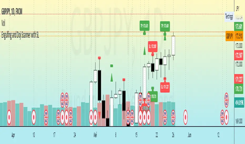
Engulfing and Doji Scanner with SLThe Bullish Engulfing pattern occurs when the close is higher than the open, and scripts will look for this pattern by checking the difference in the close and open prices sufficiently in pips. Likewise, the Bearish Engulfing pattern occurs when the close is lower than the open, and scripts will look for this pattern by checking for sufficient difference in the open and close in pips.
The Doji pattern occurs when the absolute difference between the open and close prices is very small compared to the price range for that period. The script will look for these patterns by comparing the difference between the open and close prices by a certain percentage of the price range.
After the patterns are detected, the script will calculate the Stop Loss (SL) and Take Profit (TP) levels based on the parameters set. The SL level will be determined based on the lowest price range with certain adjustments, while the TP level is calculated using a 1:1 ratio to the SL distance.
This script will display arrows and Stop Loss and Take Profit labels on the chart to assist traders in identifying relevant patterns and levels. However, it is important to remember that these scripts only assist in the analysis of patterns and levels, and a more complete trading strategy and decision-making remains the responsibility of the trader.
Harmonic ScannerThe concept of harmonic patterns was introduced in H.M. Gartley's book "Profits in the Stock Market" around 1935. Gartley formation was based on XABCD framework with particular values from Fibonacci values set. With only XABCD frame and Fibonacci values we have over 4 000 atomic combinations. Gartley formation is composed from two atomic combinations. Since then, numerous other combinations have been proposed and can be found on various internet sources. Our objective is not only to utilize known combinations, but also to develop a methodology for identifying combinations that best fit the price changes of a particular financial instrument.
The Harmonic Scanner searches for popular harmonic patterns on a chart and tracks them using typical take profit and stop loss values. The script calculates ideal efficiency by entering a position at the D point and exiting either on the stop loss or at the highest take profit value.
Furthermore, you can enable the "relaxed formations" feature to search for generalized variants of the patterns.
This script can be used by any user. There is no need to have a PRO or PREMIUM account.
Harmonic Scanner is just one component of larger "Harmonic" package, which is designed to simplify the use of the ideas proposed by Gartley and to customize them for various financial instruments.
The Harmonic package includes:
⠀⠀Harmonic Scanner - A classic harmonic patterns detector that checks efficiency by entering in D point and trading move to the take profit value.
⠀⠀Harmonic Predictor - A harmonic pattern detector that checks efficiency by entering at the C point and trading the move to the D point.
⠀⠀Harmonic Scanner TakeProfitMap - A supporting script for scanner, that tracks highest potencial profits from historical transactions to better determine the appropriate take profit values for a given financial instrument.
⠀⠀More components is under developement...
If you prefer a video explanation, please refer to the "HowTo: Harmonic Idea" video.
Script with limited access, contact author to get authorization
Script settings:
Extreme area - Specifies the range in which low/high need to be the lowest/highest bar to be counted as XABCD point.
XA limit - Specifies the maximum distance between successive points in XABCD formation pattern.
Inaccuracy ‰ - It determines the maximum deviation from the conditions that must be met by the pattern. Larger value will produce more duplicates.
Relaxed formations - Formations marked with * will be relaxed on CBD retracement.
Eliminate duplicates - Eliminates formation duplicates. We can precise the maximum deviation of results that are threaded as the same (duplicates).
Verify Predictor - Special mode what can be used to verify results from the Harmonic Predictor script.
List of formations, each letter enables specific formation.
Visualization section with independent settings for the folowing groups:
- Estimated formations ( high or low are still unconfirmed but their confirmation will add new formations),
- Positions (formations tracked for statistics)
- Traded (xlosed positions, either on take profit or stop loss)
For each group of formations following settings can be customized:
- Color used for drawing formation shape
- Checkbox for enabling/disabling shape visualization
- Checkbox for enabling/disabling target visualization
- Picker for selecting the label type
⠀⠀- h(ide)
⠀⠀- s - Labels with small font
⠀⠀- S - Labels with normal font
ShapeBox - Displays a box over formations with the formation name (useful for identifying specific formations).
Color settings - Customize the color of filled and unfilled targets.
Transparency settings - Adjust the transparency of formation shapes and targets.
Statistics - Picker for statistics table type:
H(ide) - Hides the statistics table.
P(ositions) - Shows a list of positions with their corresponding stop loss and take profit values. Take profit values that have been reached are highlighted.
% - Displays the efficiency of formations, split by take profit values.
%W - Displays the efficiency of formations, split by take profit values and weighted by formation size.
Position filter - A filter that works with the P(ositions) statistics.
Troubleshooting:
In case of any problems, please send error details to the author of the script.

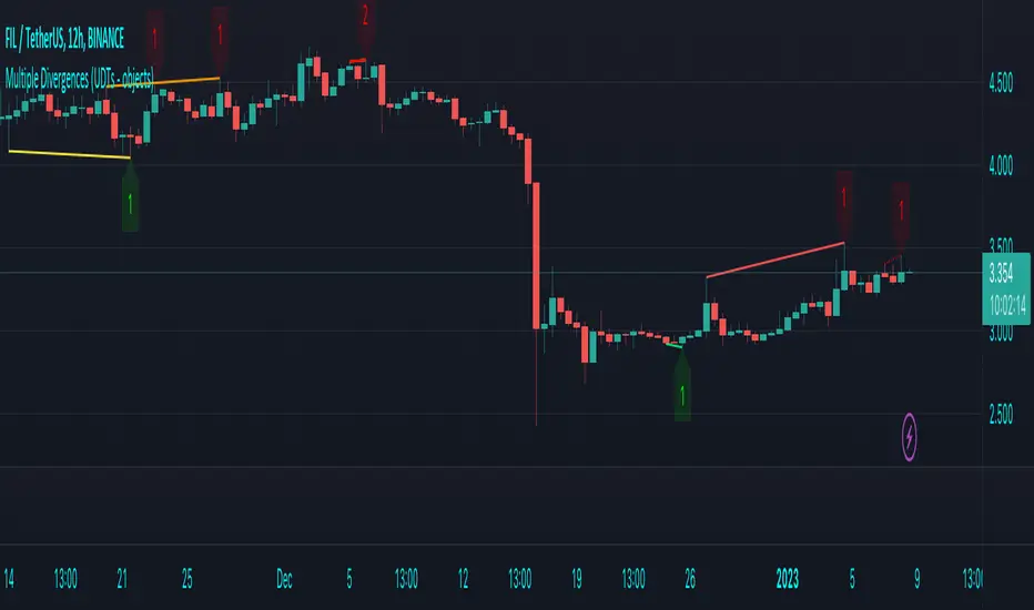
Multiple Divergences (UDTs - objects) - Educational█ OVERVIEW
This script highlights the usage of User-defined Types (UDTs) and objects , and bullish /bearish divergences.
Pivotpoints are used to find divergences, the result of this script will be different against other public multiple divergences scripts.
FOR Pine Script™ CODERS
Besides the information found in CONCEPTS , the comments in the script will, hopefully ), guide you through my thought process.
█ CONCEPTS
The main principle of this script are bullish /bearish divergences, this with 3 different oscillators ( RSI , CCI , MFI )
If you want to know more about divergences, have a look at some Education and Research idea's .
On every bar, an object HLs is made, containing bar_index , high , low , and 2 bool variables ( isPh , isPl ).
On every bar, an object Osc is made, containing bar_index , o (oscillator value), and 2 bool variables ( isPh , isPl ).
If a pivothigh (ph ) is found, isPh will be true on that bar, false otherwise.
If a pivotlow (pl) is found, isPl will be true on that bar, false otherwise.
These objects are added to an array, with limited size.
If a ph is found, the script draws a testline from that ph to every previous ph , found in the array.
Then every high in between these 2 points are checked if they don't pierce the testline .
If the testline isn't broken, the Reg_Div_Piv() function will give 4 values, 1 check (not pierced) variable and the 4 points of the line.
The testline is deleted.
Once a positive check is found, the script will perform the same, but now with the Osc objects.
The script will ONLY compare Osc pivots which are maximum 1 bar away from the high/low pivot .
If everything is confirmed, a line is drawn, visible on the chart.
█ REMARKS
A label will be visible with a number, this is the amount of divergences found with the according oscillator .
EXAMPLE
Div with RSI and CCI -> 2
Div with MFI alone -> 1
Div with RSI and CCI and MFI -> 3
...
Divergences should only be used when confirmed, this is after bar close .
As an aid, lines that are not confirmed will be dotted , if confirmed, they will be solid .
The divergence check start when a ph/pl is found, after which oscillator pivot are checked.
Optionally the same can be done, when a oscillator pivot is found and then check the ph/pl ,
this should give more results, although it can make the script slower.
█ SETTINGS
Left - amount of bars at the left which needs to be lower/higher
Right - amount of bars at the right which needs to be lower/higher
Max values - maximum values in array of objects
3 oscillator settings with
• ON/OFF
• Length
• color bullish divergence
• color bearish divergence
Have FUN !
EMA + Supertrend with BUY a SELL signals by @zeusbottradingwe are presenting you new indicator with opensource script,
this indicator uses 3x EMAs and 2 supertrends. Supertrends generate SELL or BUY labels when they are both red or green, meaning uptrend or downtrend. Main idea behind this indicator is filtering supertrend labels by 3 EMAs (filter>All EMAs Aligned) or just 1 EMA 200 Only. EMA (Esxponential Moving Average) measures trend direction over a period of time . EMA should follow price section more closely than others moving averages. In the script is defaulty set EMA1 to calculet on 21 previouse candles which is good for calculating fast moving trends. EMA2 is defaulty set on 50 previouse candles which is use for medium moving trends. End lastly EMA3 is defaulty set on 200 candles to calculate long period moving trend.
You can setup sources of all EMAs and Supertrend values including ATR period and multiplier.
We also included Bearish and Bullish Engulfing candles for more precise entries. Bearish and Bullish Engulfing candels are marked by little triangle. Bearish candles means red candles, Bullish candles means green candles. Engulfing candles should be bigger than previouse candle. Engulfing candles used to indicate a market reversal
Buy signal is shown when close is between ATRs and close price of the candle is bigger than EMA3 when its used in Filter section 200 EMA Only . If in Filter section is choosed ALL EMAs Aligned Buy signal is shown when close is between ATRs and close price of the candle is bigger than EMA1 , EMA1 is bigger than EMA2 and EMA2 is bigger than EMA3 .
Sell signal is shown when close is between ATRs and close price of the candle is lower than EMA3 when its used in Filter section 200 EMA Only . If in Filter section is choosedALL EMAs Aligned Sell signal is shown when close is between ATRs and close price of the candle is lower than EMA1, EMA1 is lower than EMA2 and EMA2 is lower than EMA3 .
ATR (Average True Range) it is trading system that measures market volatility by decomposing the entire range of an asset price for choosen period.
You can use this indicator on any timeframe and any instrument.
Made with ❤️ for this community.
If you have any questions or suggestions, let us know.
The script is for informational and educational purposes only. Use of the script does not constitutes professional and/or financial advice. You alone the sole responsibility of evaluating the script output and risks associated with the use of the script. In exchange for using the script, you agree not to hold zeusbottrading TradingView user liable for any possible claim for damages arising from any decision you make based on use of the script.

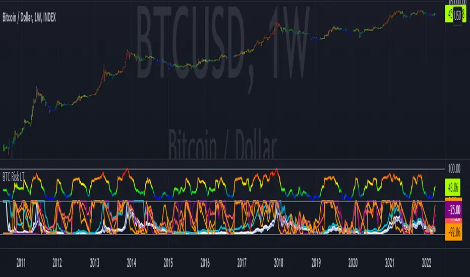
Bitcoin Risk Long Term indicatorOBJECTIVE:
The purpose of this indicator is to synthesize via an average several indicators from a wide choice with in order to simplify the reading of the bitcoin price and that on a long term vision.
Useful for those who want to see things simply, typically to make a smart DCA based on risk.
I originally used this script as a sandbox to understand and test the usefulness of several indicators, and to develop my PineScript skills, but finally the Risk Indicator output seems relevant so I decided to share it.
USAGE:
The selected indicators are the ones that I think give the best market bottoms, but the idea here is that anyone can try and use any set of indicators based on those preferences (post in comments if you find a relevant config)
Most of the indicator inputs are configurable. And some are not taken into account in the calculation of the Risk indicator because I consider them not relevant, this script is also a test more than a final version.
NOTES :
If you have any idea of adding an indicator, modification, criticism, bug found: share them, it is appreciated!
In the future I will create another more versatile Risk indicator that will not be focused on bitcoin in weekly. (this indicator is still usable on other assets and timeframe)
THANKS:
to Benjamin Cowen for inspiring me with his Bitcoin Risk metric
to Lazybear for his Wavetrend Indicator and all the scripts he shares
to Mabonyi for his Bitcoin Logarithmic Growth Curves & Zones script
to VuManChu for his VMC Cypher B Divergence
to the Trading view team for developing TV and PineScript
And to all the community for all the published codes that allowed me to progress and create this script
---- FR ----
OBJECTIF :
L'objectif de cet indicateur est de synthétiser via une moyenne plusieurs indicateurs parmi un large choix avec afin de simplifier la lecture du cours de bitcoin et cela sur une vision longue terme.
Utile pour ceux qui veulent voir les choses simplement, typiquement faire un DCA intelligent en fonction du risque.
À la base j'ai utilisé ce script comme un bac à sable pour comprendre puis tester l'utilité de plusieurs indicateurs, et développer mes compétences PineScript, mais finalement l'output Risk Indicateur me semble pertinent donc autant le partager.
UTILISATION :
Les indicateurs sélectionnés sont ceux qui permettent selon moi d'avoir les meilleurs point bas de marché, mais l'idée ici est que chacun puisse essayer et utiliser n'importe quel ensemble d'indicateur en fonction de ces préférences (poster en commentaire si vous trouvez une configuration pertinente)
La plupart des inputs indicateurs sont paramétrables. Et certains ne sont pas pris en compte dans le calcul du Risk indicateur car je les estime non pertinent, ce script est aussi un essai plus qu'une version finale.
NOTES :
Si vous avez la moindre idée d'ajout d'indicateur, modification, critique, bug trouvé : partagez-les, c'est apprécié !
à l'avenir je créerais un autre Risk indicator plus polyvalent qui ne sera pas focalisé sur bitcoin en weekly. (cet indicateur est tout de même utilisable sur d'autre actif et timeframe)
REMERCIEMENT :
à Benjamin Cowen pour m'avoir inspiré avec son Bitcoin Risk metric
à Lazybear pour son Wavetrend Indicator et globalement tout les scripts qu'il partage
à Mabonyi pour son script Bitcoin Logarithmic Growth Curves & Zones
à VuManChu pour son VMC Cypher B Divergence
à l'équipe Trading view pour avoir développé TV et PineScript
Et à toute la communauté pour tous les codes publiés qui m'ont permis de progresser et de créer ce script
WavesTrend visualization tool in Wave theory. Unlike Elliot waves, it has a constant pattern length. The formation consists of impulse and 3 corrections.
The script analyzes candle relationships in the currect trend, trend will be continueted until candle are not breaking trend rules.
Currently it supports 2 rulesets/wave variants:
Low - More sensitive (trend will change more ofter).
Meddium - Less sensitive ( trend will change less ofter).
Simultaneous observation of both types allows to detect consolidation before the overlapping movement and increase the probability of indicating the moment of the movement occurrence.
Trend visualization tools is a starting point that can be conected with different technics, to achive better performance.
"Waves" is the primary script of the Waves script series with test free period that consists of:
- Waves + XABCD
- Waves + ZOOnes
- Waves Change Signals
- ... and more in developement.
Features:
- Show Low and Middle type/order waves
- Draw both Wave types at once.
- Shadow mode that show second wave moved to the wave max/min bars.
- "Alfred" assist - Label notifications about trend confirmations or changes.
Script settings:
Trend visualization
Type - Trend visualization types:
H - Hidden
L - Low
M - Medium
B - Both
Alfred - AI assistant that informs about wave confirmation or trend changes (With "Both" type Alfred will monit only Medium wave).
Shadow - Showing second reprezentation of the trend with drawing with the use of minimal and maximal values. It's usefull to determine the delay between the peak and a wave change signal.
Low/Med Line width/color - Width/color of drawn line. Separate setting for Low and Medium trend type.
Impuls visualization
Impuls - Drawing impuls modes:
H - Hidden
F - First
S - Second
A - Auto
Impuls color - Color of the first bullish arrow.
Draw arrow - Drawing arrow at the end of the first bullish arrow.
Extensions
Waves + XABCD - Showing base information about Waves + XABCD script
Waves + ZOOnes - Showing base information about Waves + ZOOnes script
Waves Change Signals - Showing based information about Waves Change Signals script.
more in developement...
Troubleshooting:
In case of any problems, send error details to the author of the script.

Trend channel [log scale] with projection forecastTrend channel with projection forecast
This indicator is used to model data where growth or decay accelerates rapidly at first and then slows over time.
Because the channel distance is based off the largest pullback or highest peak within a trend, for effectively drawing and using this indicator it is recommended that this type of indicator is applied to mature trends .
This model is interesting for the long term series data (such as 10 or 20 years span) because can be plotted correctly on logarithmic charts .
Technical issues
*The user have to pan over the chart from the beginning to the end of the study range (such as 10 years of bars) so the pine script could generate those lines on the chart.
*If on the chart the number of bar is less than the lookback period, it won't generate any lines as well.
Disclaimer
Success in trading is all about following your trading strategy and indicators should fit into your own strategy, and not be traded purely on.
This script is for informational and educational purposes only. Use of the script does not constitute professional and / or financial advice. You are solely responsible for evaluating the outcome of the script and the risks associated with using the script. In exchange for the use of the script, you agree not to hold monpotejulien TradingView user responsible for any possible claims for damages arising out of any decisions you make based on the use of the script.

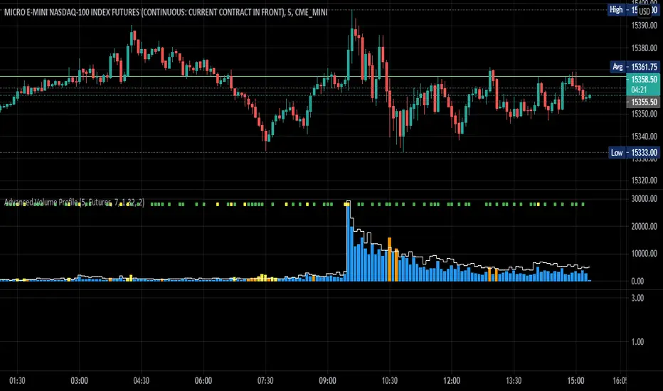
Advanced Volume ProfileTHIS SCRIPT CURRENTLY ONLY WORKS FOR ASSETS THAT TRADE 24/7 OR CBOE FUTURES HOURS!
This script plots volume relative to an asset's historical volume profile.
Usage:
As a companion to my "Unusual Time Frame Volume" (UTF Volume) script, this plots volume against the same historical volume profile used for UTF Volume.
The same high volume (relative to historical) threshold alert is available (yellow bar).
Likewise, if the volume exceeds the historical threshold, but is below the alert threshold, the bar color is orange.
At the top of the chart is an indicator which is green if a bar has higher volume than the previous bar.
You can also set a threshold for this such that if the volume of a bar exceeds the previous bar by a certain multiplier which will turn the indicator yellow.
For example, if the threshold is set to "1.5", then the indicator will be yellow (instead of green) on an increase in volume over the previous bar of 1.5x.
NOTES:
Again, this script currently only works for assets that trade 24/7 or CBOE Futures hours!
Make sure you set the "Asset Mode" and "Time Frame (minutes)" to values that match your asset and chart setting.
For example, if you are trading Futures on a 2m chart, set the Asset Mode to Futures and Time Frame to 2m.
If you are trading crypto on a 5m chart, set the Asset Mode to 24/7 and Time Frame to 5m.
If the settings are not set appropriately, the output will be incorrect/invalid.
If you choose a "Look-back (Days)" setting that is too far back given the time frame, the script will produce an error.
I suggest playing with settings from "1" (compares volume to the previous day's volume) to the highest number that doesn't break the script.
For example, at a 2m time frame, the maximum look-back will be "6" or "7" depending on which mode you are using.
Longer chart time settings allow larger look-back values.
I find that the default value ("6") does a decent job in general.
Please feel free to reuse or further develop this script.
I would greatly appreciate it if you would send me a message below if you find it useful.
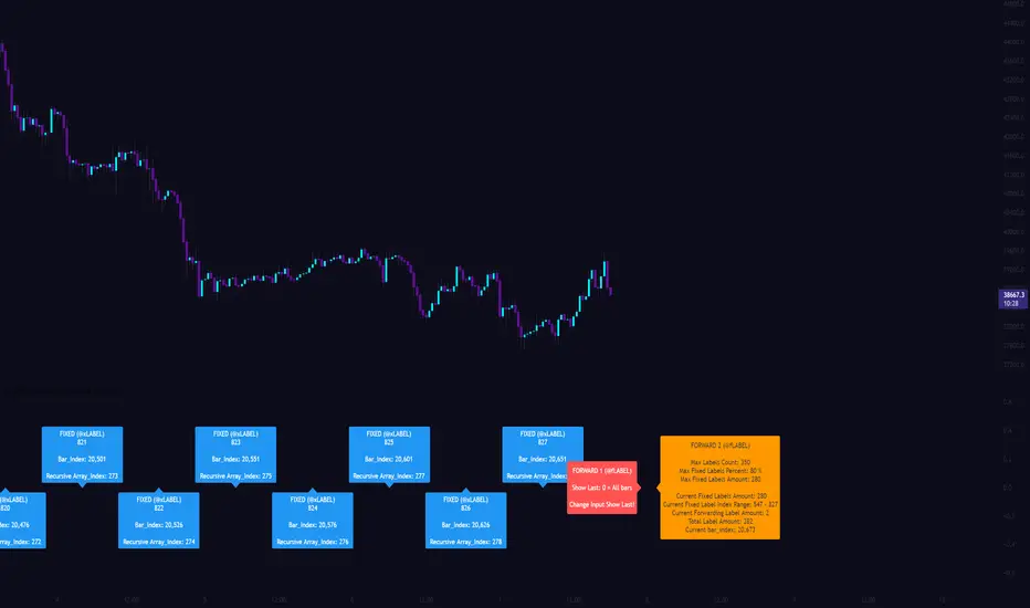
[CLX][#03] Object-Stack (Labels/Lines/Boxes)This script shows an example of how to manage objects (lines/labels/boxes) and prevent the need of garbage collecting and missing objects.
You only have to push your object into the right array.
*_FIXED (left-lock) or *_FORWARD (right-lock)
We hope you enjoy it! 🎉
CRYPTOLINX - jango_blockchained 😊👍
Disclaimer:
Trading success is all about following your trading strategy and the indicators should fit within your trading strategy, and not to be traded upon solely.
The script is for informational and educational purposes only. Use of the script does not constitute professional and/or financial advice. You alone have the sole responsibility of evaluating the script output and risks associated with the use of the script. In exchange for using the script, you agree not to hold cryptolinx TradingView user liable for any possible claim for damages arising from any decision you make based on use of the script.
[CLX][#02] Registry (type-based)This script only provides a basic __setter and __getter registration function with a type-based limitation.
We don't want to blow the code with additional conditions. The suggestion was to get the basic functionality.
Benefits:
- Get/set/update global-like variables between functions
- No init needed. You can call a entry before you set it.
Get-Functions:
- f_reg_getInt(_key)
- f_reg_getFloat(_key)
- f_reg_getBool(_key)
- f_reg_getString(_key)
- f_reg_getColor(_key)
- f_reg_getLabel(_key)
- f_reg_getLine(_key)
Set-Functions:
- f_reg_setInt(_key, _value)
- f_reg_setFloat(_key, _value)
- f_reg_setBool(_key, _value)
- f_reg_setString(_key, _value)
- f_reg_setColor(_key, _value)
- f_reg_setLabel(_key, _value)
- f_reg_setLine(_key, _value)
Feel free to contribute for an extended version. :)
We hope you enjoy it! 🎉
CRYPTOLINX - jango_blockchained 😊👍
Disclaimer:
Trading success is all about following your trading strategy and the indicators should fit within your trading strategy, and not to be traded upon solely.
The script is for informational and educational purposes only. Use of the script does not constitute professional and/or financial advice. You alone have the sole responsibility of evaluating the script output and risks associated with the use of the script. In exchange for using the script, you agree not to hold dgtrd TradingView user liable for any possible claim for damages arising from any decision you make based on use of the script.

[CLX][#01] Animation - Price Ticker (Marquee)This indicator displays a classic animated price ticker overlaid on the user’s current chart. It is possible to fully customize it or to select one of the predefined styles.
A detailed description will follow in the next few days.
Used Pinescript technics:
- varip (view/animation)
- tulip instance (config/codestructur)
- table (view/position)
By the way, for me, one of the coolest animated effects is by Duyck
We hope you enjoy it! 🎉
CRYPTOLINX - jango_blockchained 😊👍
Disclaimer:
Trading success is all about following your trading strategy and the indicators should fit within your trading strategy, and not to be traded upon solely.
The script is for informational and educational purposes only. Use of the script does not constitute professional and/or financial advice. You alone have the sole responsibility of evaluating the script output and risks associated with the use of the script. In exchange for using the script, you agree not to hold dgtrd TradingView user liable for any possible claim for damages arising from any decision you make based on use of the script.
SB Master Chart v4This is the follow up to SB Master Chart. This is a subscription only indicator.
SB Master Chart was designed with a minimalist appearance, but is able to provide a trader with all the information he needs at a glance to make informed trading decisions. This chart utilizes the alert() function so the trader can be alerted even while away from a computer to a potential trade opportunity.
Version 4 has been redesigned for maximal efficiency. Over the many iterations of the script, I introduced many new visual affects which detracted from the simplicity of the original script. I have since removed many of the eye candy and kept the fundamental visuals that made the script eye appealing. I have redesigned the back end code of the script to be more efficient with the use of custom functions. From V1 to V2 I introduced a trend filter. This made V2 a multi-time frame script. I have since removed the trend filter because it was filtering out many viable trades on shorter time periods. Despite removing the trend filter, I have kept the multi time period functionality of the script and introduced alerting on multiple time periods with one alert.
This chart incorporates the following indicators in some form
Bolinger
MACD
RSI
Stochastik
VWAP
Moving Averages
Volume
The chart utilizes a combination of 5 indicators to determine overbought and oversold levels.
The green dot indicates oversold conditions. (alerted)
The red dot indicates overbought conditions. (alerted)
The orange dots sometimes precede the green and red dots and are determined by opportunistic volume and often provide better enter and exit opportunities and green and red dots. (alerted)
The yellow dots always precede the green and red dots.
The bar colors are determined by the three moving averages the chart tracks, MA5 , MA20, and MA50.
If the bars are green, a clear uptrend is happening, red represents downtrend.
Yellow bars indicate MA5 is in an uptrend and Orange indicates that MA5 is in a downtrend.
The VWAP lines are based on the following periods and serve as support and resistance lines.
Green (20 Period)
Yellow (50 Period)
Red (100 Period)
The black horizontal lines represent the upper and lower Bollinger bands and serve as elastic support and resistance lines.
The green background represents oversold on 4+ time periods. (alerted)
The red background represents overbought on 4+ time periods. (alerted)
I have also implemented a 4 column table at the top for key indicators: RSI, Stochastic %K, Bollinger, and Daily Trend.
This script utilizes several alert() conditions of various frequency. It utilizes both the alert.freq_once_per_bar_close and alert.freq_once_per_bar options to achieve more timely alerts.
*Special Note - Set alerts on the 30m chart for best results, this will allow regular alerts for all time periods every 30 minutes throughout the trading day.
Some alerts do not require bar close and should be taken more seriously as the alert is more time sensitive.

Repulse-AORepulsion Engine is a proof of concept for a series of indicators using repulsion, as re-contextualized from the following:
www.quantamagazine.org
In my view, the technique is unique, and therefore a new category of indicator, but that distinction will, obviously, be left to the community and to the moderators. One thing that can be said is repulsion appears to be applicable to more than RSI, and while it's not featured here, it has been tested in other related work using SMA, EMA and HMA signal artefacts. Still, the script is raw and not overly clean. One might hope for a git-like versioning system and vertically oriented script window, but that would be playing the blame game, and I would lose that battle. Trading View is awesome as it is and getting better all the time.
This script features an experimental oscillator branch, also utilising some off-in-left-field number theory by which a link is posited to have been made to a fractal domain, around which the oscillator 'more subtly' picks up price movement. Three interrelated pairs are involved, but to avoid long-winded explanation, you might want to just play with changing out XRPUSDT and XRPBTC for two other similarly related securities. Several other scripts on the workbench over here automate this process.
No doubt, more able programmers will easily enhance this and other scripts which arise. If there's interest in this one, more of the raw 'it's not really ready' scripts will likely follow, so people can dig in and do their own mashups sooner rather than later, tossing what is bad and enhancing what is good.
It might be better, and garner a lot less flaming, if this indicator is described as experimental all the way through.
Stubs are present here for users to test performance on their own.
I hope you get something out of it, and if you make one of your own or move this along to a higher standard that you drop me a line to let me know. I'm always eager to learn and to grow.
Binary Option Turbo M1 by MercalonaAuto risk
You are diving into a high-risk investment. We are not responsible for losses, the only certainty is that they will come, the most important thing is to manage them. Test this script on a demo account, and use the backtest. Make sure you are familiar with it before using real money. Use all your experience and other assistance for better accuracy. Do not risk more than 5% per day. Try to use a maximum of 1-2%.
Recommendations
It is highly recommended whenever trying to make entries in stronger areas
Try to make entries when the graph is in trend and with good movements. It is better to lose an entry than to lose money.
Check if the chart is already with good accuracy before making your entry. At least 65%.
Try to make entries when the payout is above 75%. This will help you with risk / return.
About the Script
This script was developed to identify good entry areas quickly and safely. We recommend using in binary option, where the next candle is successful. Although it can also be used in other markets, using a larger timeframe, such as 1h or 4h.
How it works?
This script is based on trends, up and down, where up trend, we look for "CAL" entries in retractions, and down trends, the entries will be "PUT". Always operate in favor of the trend for better accuracy. A session filter is also displayed. The Filter is based on the New York and London session. In these periods there is a greater market volatility, where it is recommended to operate and avoid losses. In addition, there is also a (no trend) filter. Where it shows whether the chart is volatile or not, even during open market sessions.
What is the final result?
This script will show good entries areas. These areas are represented with lines. The lines closest to the current price are thinner lines. And the lines far from price are thicker. The thick lines represent stronger areas and are resistant to price. This means that there is a greater possibility of reversal when prices touch these lines.
Settings (mode)
There are 2 configuration modes:
1. MODERATELY
2. AGGRESSIVE
Using the "MODERATELY" mode, the signals are rarer, here we expect the price to hit the best areas indicated. To place the entry. Here we expect greater accuracy.
In "AGGRESSIVE" mode, we don't expect good entries. Whenever the price hits entry areas it will be considered an entry. In this case, the accuracy is less, since the areas do not have a great potential for reversion.
Settings (Length)
Here the number of bars can be configured for the calculation of support and resistance areas. A low amount may not be enough to check for good areas. And a very large area can be confused with areas that really matter. Try to check the best quantity for the chart you want to trade.
Settings (Win Rate Limit)
Place the limit of analyzed signals in this field. It is restricted to the “Win Rate Max Bars” field, which will be explained below. If the configured limit is not reached, the cause is that there were not enough signals within the configured bar limit. ATTENTION: Understand that a high value will cause a slow calculation of the script.
Settings (Win Rate Max Bars)
This is information is used to limit the number of bars in the “Win Rate” calculation. ATTENTION: Understand that a high value will cause a slow calculation of the script.
Settings (Sessions)
There are 2 other configurations. New York session and London session. You can see how it works reading below.
Indicator “Stars of Recommendation”
The indicator has 3 stars of recommendation.
NO TRADE (There is no positive point to take chances)
In Session (At least 1 open market, this is a positive point to take chances)
In Trend (There is a good probability of assertiveness when it is on trend)
More than one identified area. (Generally, when there is more than one area, the more distant areas become stronger and stronger. This is a positive point when the price reaches them.)
Good luck ❤️
Please feedback us.
We hope this helps you!

Pearsons R historic breaks ( for making strategy out of it )Pearsons R adjustments of linear regressions is a good tool to analyse visually the trend basis channeling of the market,
one of the common challenges in the scripts which i came across the tradingview community is the lack of the historic places put over the charts where the price actually crossed up/below the channel boundaries,
For me in order to do so we would have to replay the scripts over and over.
So I came up with an addon extension to a good script on the community ()
I have added the historic marks over the charts ( blue/green/red/orange Arrows which you see on the charts)
These arrows are the places where the price have crossed the channel boundaries historically
So,
Blue arrow = Bull Intent ,Place where the upper channel boundary line have been crossed
Orange arrow = Bear Intent , Place where the Lower channel boundary line have been crossed
Green arrow = Bull Max , Place where the Maximum Upper channel boundary line have been crossed
Red arrow = Bear Max , Place where the Minimum Lower channel boundary line have been crossed
For me this type of approach is good for making a strategy out of the concepts visually, in congestion to other indicators
I would suggest you guys to check this on alert basis with your setups to derive out the best from linear regressions
Lastly it would be a pleasure to give credits to the creators of Pearsons R scripts in Tradingview
@midtownsk8rguy
@TradeBoneDogs
@x11joe
Also thanking Tradingview for providing us such an awesome community and platform :)